


Dead Dads Club
06.12
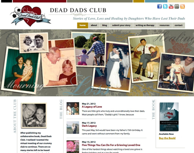
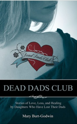
The latest book by Mary Burt-Godwin deals with stories of love, loss, and healing by daughters who have lost their dads. The new logo, book cover design and website that recently launched in May reflects the nostalgic melancholy found through loss and grief. The author wanted to create an approachable feminine sensibility yet keep her personal edginess, thus the tattoo theme was born. The website is an interactive safe place where women can share their stories about their dads, and receive needed support from their peers. Click Dead Dads Club for the site. Buy The Book
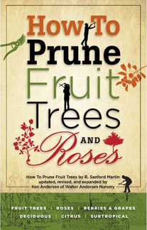
Redesign of Pruning Book for Walter Andersen Nursery
03.12
We had to reorder after just six months in print again! Could it be the new design?! When R. Sanford Martin wrote the first edition of this book in 1944, his intent was to take the mystery out of pruning all kinds of fruit trees which was a standard gardeners have used for decades. After going out of print, Walter Andersen Nursery realized there was still a demand for the book and decided to reprint it. This revised edition contains new chapters on pruning tools and also on pruning roses, another area gardeners seem to be leery of. Written by Ken Andersen of Walter Andersen Nursery, these chapters round out the content of the book. We wanted to capture the vintage look of a 1940s book while bringing it into the 21st century. Original hand-drawn illustrations from the original book were included to relate to that hands-on, hand-crafted feeling of working in the garden. Available on Walter Andersen Nursery’s book shelves and website Walter Andersen Nursery.
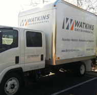
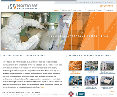
Watkins Environmental Website Launch & Rebranding
03.12
Ty Webb Design has rebranded Watkins Construction, a hazardous materials remediation and demolition company into Watkins Environmental. Watkins is building a solid, modern, corporate look as they are a leader in the environmental clean-up industry in the western U.S. What you can’t see online is the introduction of metallic silver on printed materials and vehicles. With so many people going digital, some forget how using different materials or techniques can add to a brand. A little something to stand out from the competitors. Check out the new website.


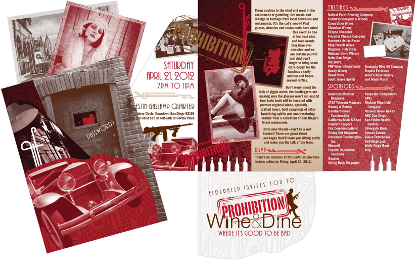
Prohibition-Themed Fundraiser for Elderhelp Promotes “Its Good To Be Bad”
02.12
What a great project to be involved in. Not only will it be a great event in downtown San Diego, it helps fund a great non-profit, ElderHelp, in keeping older people in their homes and assisting them in living active lifestyles. The goal here of course was to capture the underground, dark, mysterious vibe of the Roaring ‘20s during prohibition. Vintage wallpaper patterns, vintage graphics and rich colors, sexy ladies, drinking, guns and gambling set the tone. Hey, if you are in Southern California, why not see what its all about!

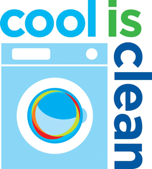
“Cool Is Clean” Campaign
09.12
Cold water to wash all clothes? Of course! The branding for this national campaign had to appeal to and compel consumers to change their hot water usage to cold water for washing clothes. A marketing campaign includes flyers and magnets to educate consumers about environmental and monetary savings. Starting in four U.S. cities, the campaign will be introduced in more cities in the new year.
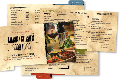
Marriott Marina Kitchen Menu
11.12
It’s today’s room service. Local farmers with farm-fresh vegetables and locally-sourced meats. We designed an earthy, rustic and cozy menu for the comfort food that Marina Kitchen serves up so well. And what’s uniques about this room service is that you pick it up! Tabbed pages housed in a binder makes it easy to navigate. And the rustic type gives it a cozy feeling. Marina Kitchen website


©2015 tywebbdesign.com | san diego california | 619 417 0403
